Enhance User Experience with Theme Switching in SAP Analytics Cloud
Switching between themes in SAP Analytics Cloud (SAC) Enhanced Stories offers unparalleled flexibility and customization for a more engaging data experience. By leveraging the power of Theme Builder and integrating JavaScript and CSS, users can seamlessly tailor their dashboards’ appearance to align with specific brand guidelines and aesthetic preferences. The Theme Builder simplifies the application of themes, enabling effortless changes to fonts, colors, and layouts, while the coding aspect provides granular control for advanced visual modifications.
This dual approach not only enhances storytelling by creating consistent, visually appealing reports but also significantly improves user engagement and readability across SAC stories. Optimizing themes elevates the user experience and strengthens alignment with corporate design standards. This method of blending system-based tools and custom code provides a powerful way to maximize SAC’s potential, whether for enhancing dashboard clarity or improving data presentation aesthetics, ultimately boosting both functionality and brand identity.
Switch between dark and light theme
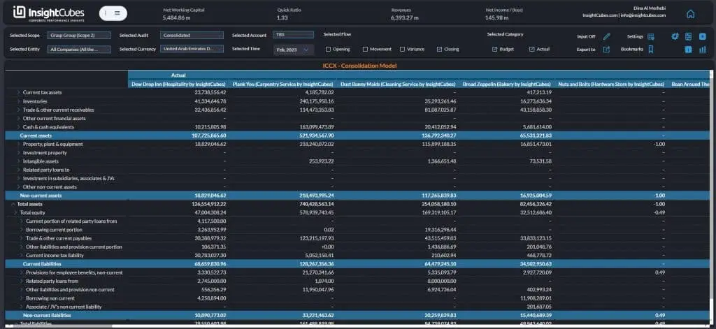
The dark theme in enhanced Stories reduces eye strain in low-light settings while enhancing data visibility with high contrast. Its customizable elements support brand identity, improving user engagement and effective storytelling.
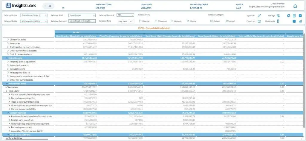
The light theme in enhanced Stories offers a clear layout that enhances readability and data comprehension. Ideal for bright environments, it features customizable options that align with corporate branding for a professional presentation.
Create both themes and setup their preferences
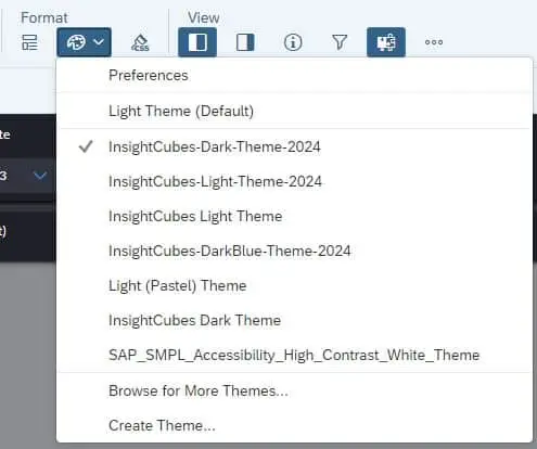
InsightCubes offers meticulously crafted dark and light themes tailored to achieve desired outcomes. These themes are designed to enhance user experience and engagement while aligning with specific project requirements.
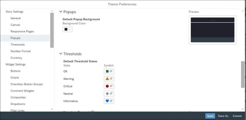
Upon developing both the dark and light themes, we proceed to implement JavaScript code that facilitates seamless switching between themes. Additionally, we enhance the visual appeal of specific widgets by integrating custom CSS, providing intricate design elements and details that enhance the overall aesthetic beyond the default theme offerings. This approach ensures a more engaging and tailored user experience.
Setting up the theme switch
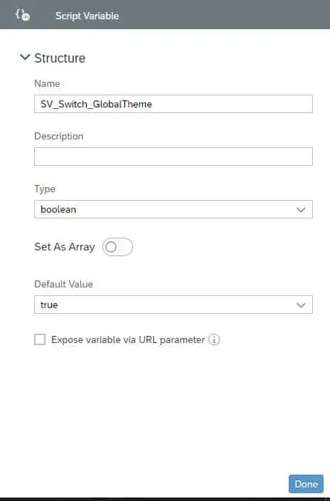
Add a switch the story and create a Script Variable, we called it SV_Switch_GlobalTheme. Select Boolean for the Type and set the Default Value to True
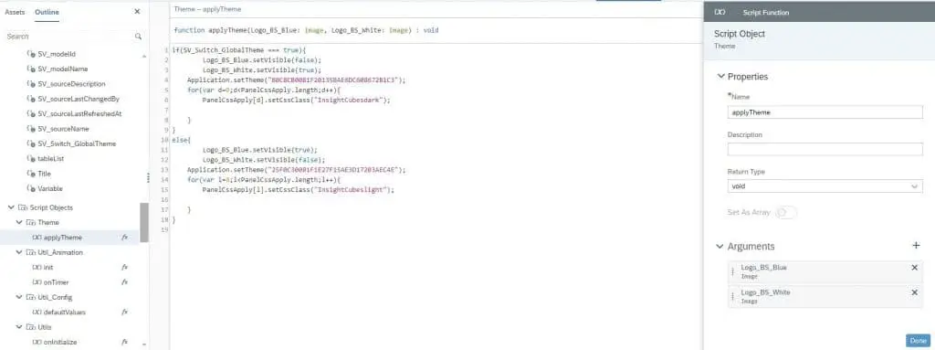
Create a Script Objects and add a Script Function, name it “applyTheme”, and write the below code in its fx.
If your design and logo calls for adding two different colored logos depending on the background, you can incorporate the show and hide of each to fit the design needs in this step, as shown in the picture below, we added two arguments to switch the logos in all the story’s pages in one click. In the next step you will notice that we referenced the logos in the switch fx code, in other pages and since this is a script function, we reference the other added logos.
Example: var Logo_BS_Blue = Logo_LandingPage_Blue;
In the next story page, on its onActive fx, we would reference the Script Function and say it is equal to the name of the logos in the current page. This way the logos will switch to the correct one per page as soon as it is active.
Example: var Logo_BS_Blue = P2_Logo_BS_Blue;
Write the code on the switch widget as shown in the image below
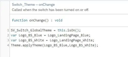
As seen in the image, we first referenced the Script Variable, then the logos, and then the Script Object and its Script Function. Note that if any Arguments are added to a Script Function, they have to be referenced where ever the Script Function is used.
Adding more details to the theme using CSS
Some widgets, like popups, have two ways to be added to the story; popups and story popups. In the theme builder only the background of the story popup can be specified in preferences. To be able to change design elements in the popup upon theme change we need to use some CSS magic.
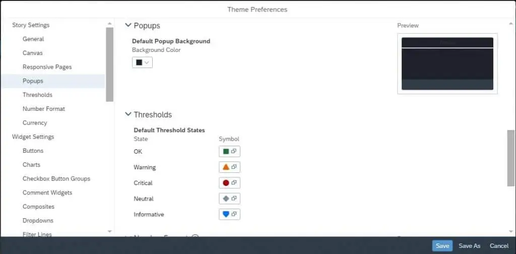
We will be sharing a snippet from the Ownership dashboard for this section to demonstrate our approach.
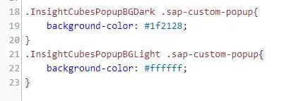
We only used the .sap-custom-popup class name and background-color property to apply the needed change upon theme switch.
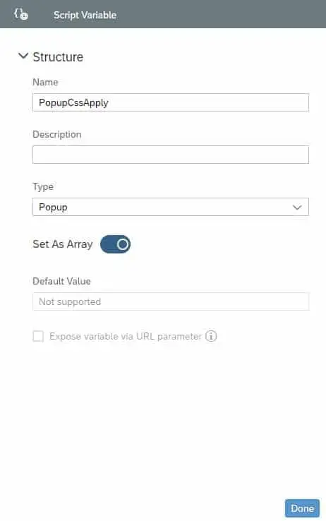
After writing the needed CSS, create a Script Variable with the type Popup and set as array
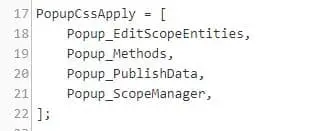
Call the Script Variable in the Pages’ onInitialize and list all the popups you want to be affected. Add the CSS class name you want to be the default, “ours is the dark” to each referenced popup’s class name. In our case it is the: “InsightCubesPopupBGDark” in their Styling CSS Class Name
Reference the PopupCssApply Script Variable in the applyTheme Script Objects.
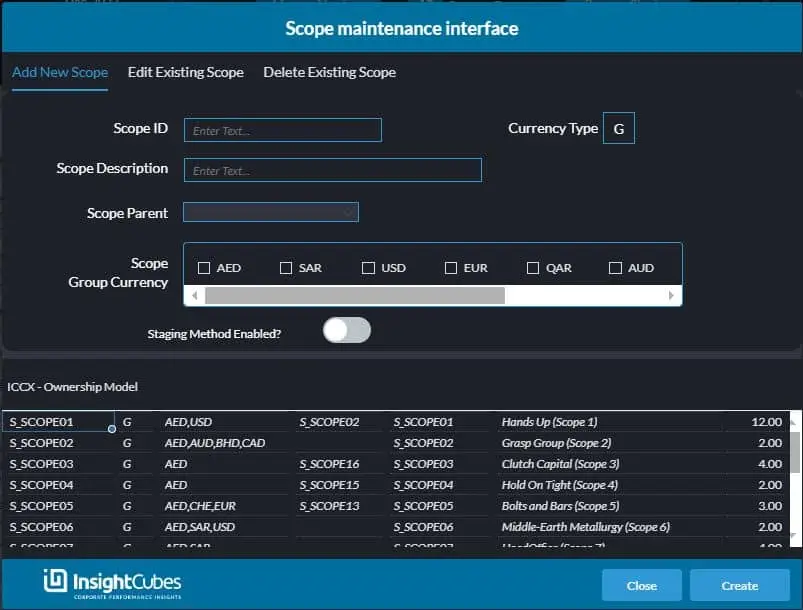
Dark theme is the default on run time, and the switch will apply the light theme on first switch click and then dark theme upon second switch click.
Light theme upon first click on theme switch.
