By integrating R, SAP Analytics Cloud transforms data analysis into a more powerful and interactive experience. R, the versatile open-source language for statistical computing and visualization, enhances SAC’s capabilities, enabling users to create insightful, dynamic stories that reveal patterns and trends in ways standard charts cannot.
What Is R?
R is an open-source programming language and software environment for statistical computing and graphics, maintained by the R Foundation for Statistical Computing. It’s one of the most popular tools among statisticians, data scientists, and analysts for tasks such as linear and non-linear modeling, time series analysis, clustering, and more.
When integrated with SAP Analytics Cloud, R allows you to perform advanced statistical analysis and create rich, interactive visualizations that go beyond SAC’s standard charts. With R, you can:
- Insert R visualizations directly into your SAC stories
- Interact with these visuals using filters and input controls
- Edit and preview R scripts in real time
- Share stories containing R visualizations with other users
Note: Although SAC stories only support adding R visualizations, you can run any R script – including statistical models or clustering algorithms – as long as the necessary libraries are validated. For instance, you could execute a clustering model in R and then incorporate its results directly as a visualization within your SAC story.
Accessing R in SAP Analytics Cloud
Before adding R visualizations to a story, you’ll need an active R server connected to SAC. This setup is typically managed by your administrator and includes parameters like:
- Server or host address
- Port number
- Encryption certificate
- User credentials
Once the connection is established, you can start creating R-based visualizations within your SAC environment.
Working with R Packages
R offers thousands of packages for visualization and analysis, giving you complete creative control. One of the most popular options is ggplot2, ideal for producing static and publication-quality charts.
Depending on your case, you can choose between:
- Static outputs – with packages like ggplot2 or lattice
- Interactive outputs – using plotly, highcharter, networkD3, or DT
This flexibility lets you tailor each visualization to your analytical goals – from simple trend plots to fully interactive dashboards.
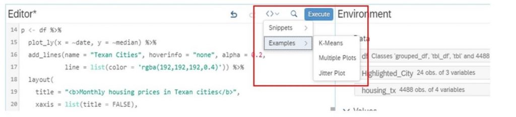
Inside the SAC R Script Editor
The R script editor in SAC is designed to feel familiar, especially if you’ve used RStudio. It’s divided into 4 panels:
- Editor (upper left): where you write and execute your R code
- Console (lower left): displays code execution, warnings, or errors
- Environment (upper right): shows information about your active data
- Preview (lower right): renders the resulting visualization to be added to your story
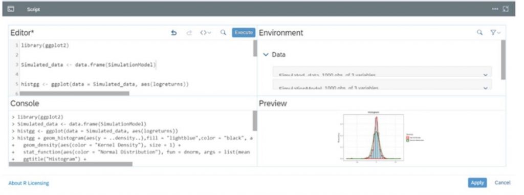
This layout provides an intuitive, end-to-end workspace for writing, testing, and refining R visualizations.
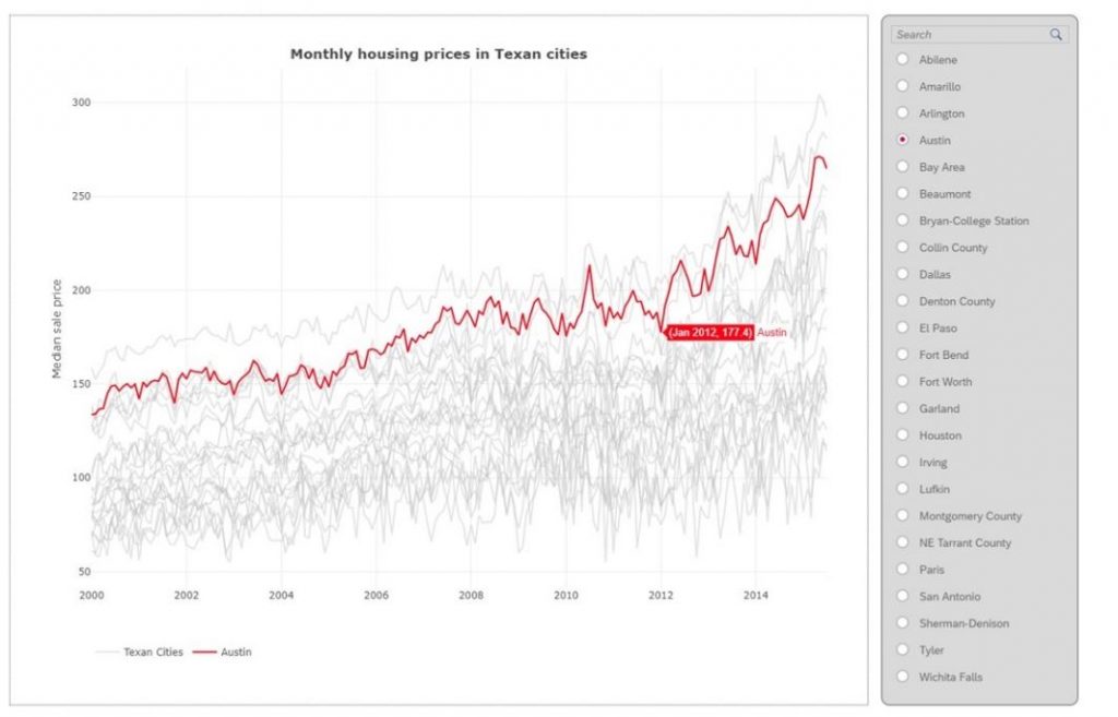
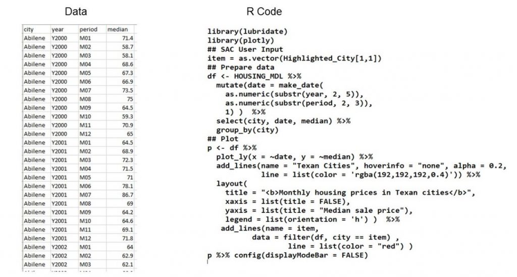
Housing Data Visualization
In a typical R visualization workflow, you might use a dataset such as Housing Data to demonstrate trends, distributions, or relationships. After writing your R code, SAC lets you add interactive controls – such as filters or parameters – that make your visuals dynamic and user-friendly.
How to Create a Simple R Visualization in SAC
An R visualization in SAC is composed of 3 main components:
- Input Data: Based on a model, selected dimensions, and filters
- Input Parameters: Configurable using calculation input controls
- R Script: Executed to generate the final visualization
Step 1: Create a Story
Start by creating a new story in SAC.
Go to Create → Story and decide how you want to begin – either by choosing a template or accessing existing data. You’ll connect your story to a predictive or acquired dataset that will feed your R visualization.
Step 2: View and Prepare Data
When viewing your data, you’ll typically see columns such as city, year, period, and median. This view helps you confirm that your dataset is structured correctly before building visuals.
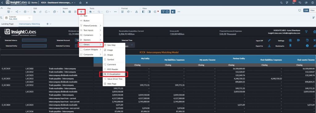
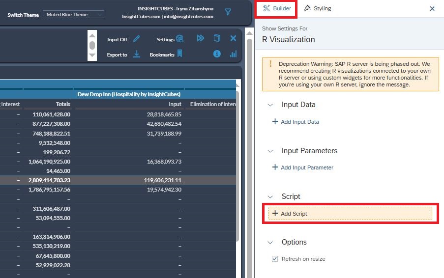
Step 3: Insert an R Visualization
From your story canvas, choose Insert → R Visualization.
A configuration panel will open, allowing you to define your input data and visualization settings.
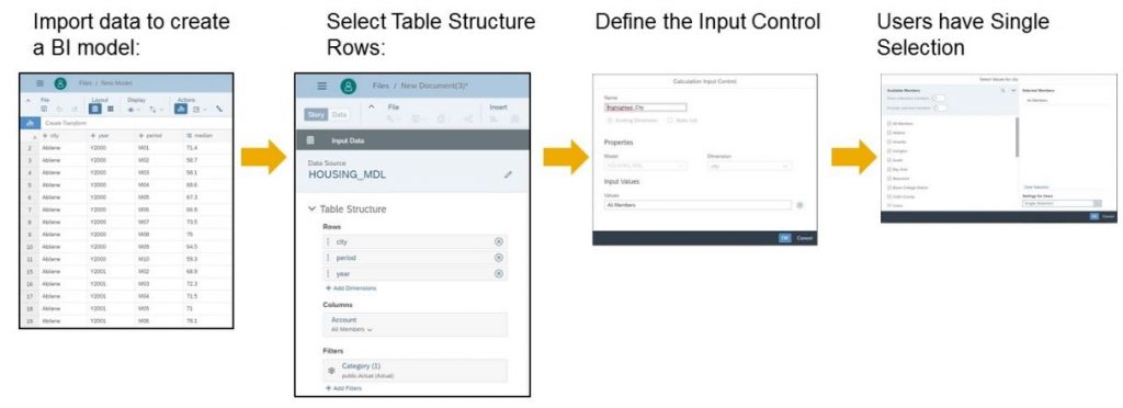
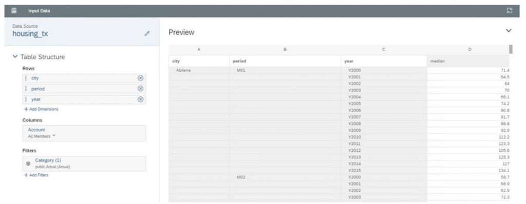
Step 4: Create the Table Structure
In the R Visualization Structure dialog, select + Add Input Data.
Under Table Structure, specify:
- Rows: Add relevant dimensions from the available list
- Columns: Manage and select measures (choose All Members if needed)
- Filters: Apply filters to narrow your dataset
Step 5: Add Input Parameters
You can make your visualization interactive by adding parameters. Choose Add Input Parameter, then select an input control:
- If your story already contains calculation input controls, pick one from the list.
- Give your parameter a clear name.
- Choose Existing Dimension (to let users select from dimension members) or Static List (to define your own options).
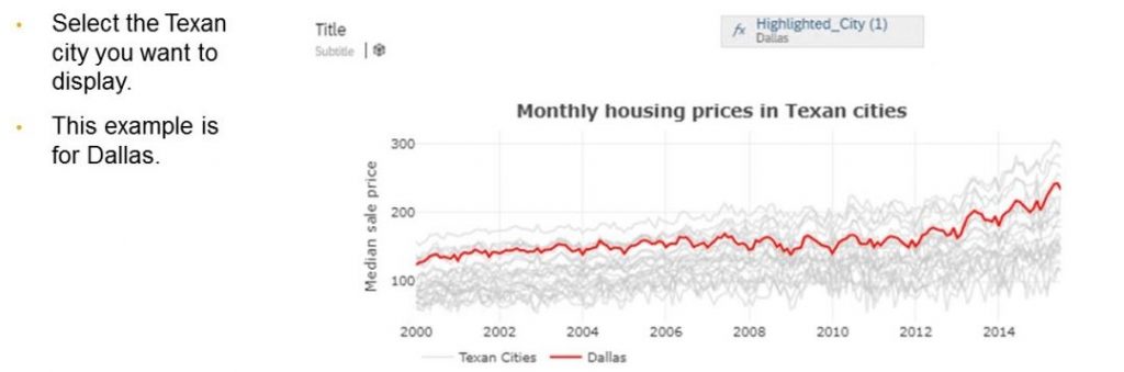
For example, selecting an existing dimension like City allows users to filter the visualization dynamically and explore data by region.
Step 6: Apply to the Canvas
Once your R script runs successfully, SAC displays the following:
- Environment: Lists variables from the script output
- Console: Shows the executed code and any messages
- Preview: Displays the generated visualization
If everything looks correct, choose Apply to insert your R visualization into the story canvas.
Final Thoughts
R integration in SAP Analytics Cloud bridges the gap between business analytics and data science. It enables analysts to move beyond standard charts and create advanced, interactive, and statistically meaningful visualizations – all within the familiar SAC interface.
Whether you’re visualizing housing data examples, building predictive insights, or experimenting with interactive dashboards, R opens the door to a richer storytelling experience in SAP Analytics Cloud.